

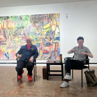
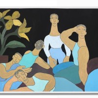
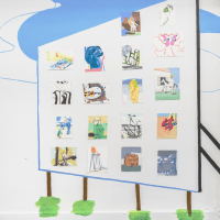
Contributed by Sharon Butler / Ever since I first saw Stephen Westfalls paintings at Daniel Newbergs gallery back in the 1990s, he has loomed large on my radar. He has engaged with geometric abstraction in singularly rich and sophisticated ways for more than thirty years, never complacent but always considered. Last week, I had the opportunity to talk with him at Alexandres new Lower East Side space, where his work is on view through December 22. His paintings have been moving away from the grid for years, and these new ones are a revelation. Hes gone all the way, introducing new ideas about perspective, transparency, and the diagonal, and fully exercising his abundant and learned sense of painting humor.
Sharon Butler: I read a few of the previous interviews with you, and I was struck that so many things that you are thinking about in the studio are the same things Ive been thinking about. I appreciate how well you articulate them. For instance, we both believe deeply in the importance of surfaces. Sometimes people come for studio visits, and they might like something, and Ill have to tell them it needs more paint on it. They dont really understand what that means, but you do.
Stephen Westfall: I think painters are always trying to figure out how to keep painting. Once you put the brush down, we go back to everyday life. Painting is a wonderful meditation, sort of a hatch door out for those of us who are inclined to paint. But you know, your surfaces and my surfaces are really very different. You balance flat planes against more amorphous vapors.

SB: Yes, our surfaces themselves are very different, but the attention to surface is the same. I think theres meaning in how painters manipulate surface.
SW: Yes. Think of Tintoretto. The variation of surface being part of the storm. I tend to go back to icons where everything has the same density. Ive always thought that icons are trying to represent the light and space of eternity. If you think of infinity as being an analogy of eternity, then eternity is as close to us as it is far away. So it needs to be the consistency of a stick of butter in a funny way. Color infinitely regresses and it infinitely advances. I break up surface with color. Your color is more subdued with subtle variations of value. Over time, Ive come to be drawn into the eruptive effects of post-Albers-ian color.
And we are both interested in the power of the diagonal. Im coming out of a 30-year preoccupation with the grid. You released that much earlier in your practice than I did. I would disguise it, draw it from everyday life, but it was still present. The way I began to escape was in fits and starts by introducing the diagonal.

SB: And the diamond. The diamond is an underrated geometric shape.
SW: Yes! The diamond is the most underrated of all the geometric shapes!
SB: I mean, the triangle gets more than enough attention these days. But the parallelogram and the diamond not so much.
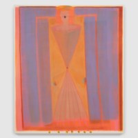
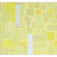
SW: And the quadrilateral and the trapezoid. Pity the poor trapezoid. But if you were to step up to the surface of my paintings, you would see that its even, but thats not the first thing you see. The first thing the eye tells you is that there is a lot of color jumping around in these springy trapezoids and diamonds. The original diamonds were also tied to the grid. My impetus was, in fact, a gothic stained-glass window constructed of classic diamond shapes. I stared at it for years when I was in church. At some point I said, oh, Im looking at a Matisse because of the way the light was sprinkled around, and the different colors. Now, Im really kind of a slow burn, if not a hammerhead. And I realized I was looking at another variation of the grid and I could make a painting of that. And then I saw the rows of diamonds as a way out. I had been introducing diagonal lines into the grid before that, but they were still in the grid compartments and the diamonds were created, not accidentally, but they were the result of larger alignments. Just doing a gothic diamond window was pretty nice. It plays with the gag of the picture plane being a window.
You know, if you paint for a long enough time, you have these revelations. When I was contemplating Barnett Newmans The Wild, its about an inch and three-quarters wide and seven feet tall. I think of that as the first shaped painting. Its a single zip, and it just sits there. Theres no getting into the space of that painting. I realized that that painting was an arrival not a departure. It was something coming through the wall into the room. Effective use of pictorial space must account for a coming forward as much as a receding back.
SB: Yes, I agree. Remember when Frank Stella did a series of lectures in the 1980s about this phenomenon? They were published in a book called Working Space. It has been important to my own work.
SW: Yes! I still teach it! Despite the macho thing, Stella is a wonder. Those early paintings, though the exotic birds, one thing after another, then sculpture, Moby-Dick. And, after some literary missteps, he wrote Working Space, which is one of the best books ever written about how to construct a painting. In the paintings from the last few years, Ive done a kind of joking, loose nod to perspective, by widening the intervals as you scan toward the bottom. The intervals widen and they compress up at the top. Thats an allusion to that sort of coming forward that Stella talks about in his book, even though everything is already flat.

SB: One of the things I love about your paintings is that they are full of inside jokes for other painters. For instance, the play with perspective in Reclining Harlequin. The diamonds get thinner as they move up the picture plane, creating an unexpected illusion of space while also nodding to Picassos harlequins.
SW: One of my favorite titles. Maybe my all-time favorite! Or maybe its Punctae. Because the punctum is the whole Barth-ian thing about what you look at, even if its not the subject of the image, the hub of the wheel that the picture revolves around. And that painting has three big yellow diamonds, placed horizontally, with three tiny red diamonds in between them. What if you have more than one punctum? Punctae!
SB: Yes! So funny [both laugh]. The paintings in this show seem to be the first ones in which you are thinking about overlapping shapes and transparency, or I should say, the illusion of transparency. Although now that you have told me about the gothic stained glass at your church, maybe its a result of looking at stained glass.
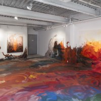
SW: Well, I did something like a real stained-glass piece for the subway in Queens, but the wall paintings came first. They actually came out of an offer by an architect, Stan Allen, who was designing an open-air chapel in the Philippines. As happens to many artists who are invited to do stained-glass projects, I never got to complete it because they ran out of money. They built the chapel, and I did some recesses in the front facade, but the stained glass itself got cut out of the budget. That was when I began to think about architectural scale. Ive always thought of painting as a capstone to architecture anyway, and I think it goes back to painting as icon. I had a dream in 2007 about Solvent Space, this space where my friends Polly Apfelbaum and Katharina Grosse had done projects. I dreamed that I painted the entire space! When I woke up at 5am, I immediately typed out a letter to them, on fire from my dream, explained the idea to them, and they bought it! I worked with graduate students, and we got a donation from Benjamin Moore– Regal Select, which I continue to use because its archival, lightfast for twenty years. We had to use tape, which I dont like to do, but the shapes were so big the ceilings were 22 -feet high! We used rollers, applying more than one coat to get the color depth I wanted. And then, for my subsequent solo show at Lennon Weinberg, my friend Jill Moser suggested I do some wall paintings, so I did, and thats how I got started making wall paintings.

SB: Do you consider the paintings on the walls of the front corner of the gallery two paintings or one?
SW: Two, but they go together. I wanted to create a little explosion. The points are untied from the corners of the rectangle so they can fly free. I made gouaches of the shapes for each panel and then we angled them into a mock-up on the computer. Like the rest of the paintings in the show, they are not tied to symmetrical relationships with the rectangle. They are more asymmetrical, although certain hidden interior points make everything feel acute. We used tape and the Benjamin Moore paint.
SB: When you talk about using tape on the wall drawings but not on the paintings, this brings us to an interesting conversation, especially for painters who are engaged in geometric abstraction, about the quality of the edge. Edges in your work are the result of shapes butting against one another. You use rulers to draw out the image with pencil, but then you paint freehand, without tape. Most would consider your paintings hard-edge abstraction, but within that genre, the lines are quite soft, with colors of previous paint layers peeking through. Have you ever considered going in the other direction drawing the shapes completely by hand and not using a ruler at all?
SW: I guess, no, it doesnt interest me. The ruler is a transparent tool. Inevitably Im using the hand to get the edge without tape. I blow past the boundary of the lines and then I fix them. The ruler is just a place marker. Of course, when I was growing up, my first painting classes were with Paul Wonner from the Bay Area Figurative group, I was influenced by John Altoon. I did plenty of Altoon-ish, and de Kooning-ish sort of freehand drawing, I suppose. But their work has to do with going overboard. You know what? I was doing expressionist freehand paintings when I first started showing at Tracy Garet, and then I decided that Martha Diamond did it better than me. Her 1980s paintings were just inimitable. I began to want something else. There are so many painters that I love who are not like each other, and I began to steer my conversation back toward Agnes Martin and John McLaughlin. Not as a dodge, but as a sense that there was something I could do in that territory. The hard edge is essential for me. I need the tension. The deadpan humor. Otherwise, theres no equipoise.

SB: Lets circle back and talk about the illusion of overlapping shapes that youve been exploring in this new body of work.
SW: Its more than an illusion. The diamonds and quadrilaterals are being created where other shapes, like the sawtooth, and voids meet. You have to give each shape created by the overlap its own body and intentionality as a shape. Color and surface become the vehicle for honoring each shape. Each one is a jewel. Thats what creates the ambiguity thats necessary for art, as opposed to using a kind of formula. And as I paint my way through, sometimes I begin to find places for new colors that can have content. Kind of like the golden egg, or a new kind of light. For instance, the yellow diamond in Treasure. That color doesnt appear anywhere else, but it will. I always find occasions to reuse the new colors, carry them forward later in new work.
SB: I like the way you put less saturated colors alongside the more highly saturated ones. As if to say, in your funny way, everyone is welcome here.
SW: Thats great a real emotional reading. I think for the reasons of feelings that I have never been able to articulate, Ive always tried to space out the primaries and the high-contrast colors against the field. You can see I do that, even though now Im beginning to let paintings have dominant hues. Samba da Lua is in essence a blue painting. Kind of a nocturne.

SB: Lately, Ive been thinking about how artists are more drawn to positioning their canvases vertically rather than horizontally, and most of your work here is vertical. Are you drawn to the vertical format for any particular reason?
SW: Well, Ive painted big horizontal paintings in the past. One time I had a piece at Danny Newbergs gallery a fourteen-foot-long double diamond. According to anthropological theory, as we stood up, our point of view changed, which ties into language, to tool-using. And for a viewer, theres more tension in a vertical. And certainly, in architecture. If a building or a room is a prosthetic extension of the body in the otherwise ferocious and inhospitable natural world, the idea of keeping the building upright is where all the tension is. Starting with the foundation and building up from there.

SB: I like the use of stealth asymmetry in your work for instance, in Little Tango. If viewers didnt spend some time looking carefully, they would think it is symmetrical, but the shapes are slyly off-center.
SW: This goes back to Arnheim. If you put something dead-center, its at complete rest, but if you put it off-center in a composition, then there are all these different centers of attraction. Like the energy centers of a molecule. The corners and the edges begin to vie for attraction. They are all energy centers in the rectangle.

SB: Indeed. Thanks for taking the time to walk me through the show and tell me about your paintings. Is there anything else you want to say about this particular body of work?
SW: I hope people hear things and taste things when they look at my work. I have synesthesia and I try to use the restraint of geometry and the structural aspects of color to somehow operate in a space where there is still music and flavor and scent. On the one hand, there is all this ebullience or overflow, but, on the other, there is restraint. I find that to be a humorous state. But I would also say that these are among the least restrained paintings Ive made, because they are up-front about not being tied to the two-dimensional evenness of the grid. I worked on that painting [points to Atelier II] for two years due to various accidents and frustrations, so there is tedium in the studio and theres also bliss. But either way, Id rather be in the studio painting than doing anything else.
The other thing I have to say is that Ive never been happier with a gallery space. The near-squareness of it, the architectural details like the diamond ornaments of the pillars, too. I think painters, if they are being honest, would say that a painting isnt finished in the studio. We paint for space. I have a library of imagined spaces in my mind. In a receptive space the work finds its apotheosis. It completes itself. Im very fortunate for this show to have this space. Its an incredible gift.

Stephen Westfall: Persephone, Alexandre Gallery, 291 Grand Street, LES, New York, NY. Through December 22, 2021.
Related posts:
Interview: Stephen Westfall in Industry City (2015)
Catalogue essay: Paul Pieroni on Peter Halleys 1980s painting
Sense and sensibility at Lennon, Weinberg
Frieze Weekend
Two Coats of Paint Fundraising Update: After nearly three weeks, we are more than halfway to our fundraising goal! Thank you, readers, for your generous contributions. If you enjoy our art coverage and have not yet donated, please consider making a tax-deductible contribution. Help keep Two Coats going in 2022. Thank you! Click here to contribute.*


Sparking conversation on the intricacies and character of surface – taking us in among the jostling shapes, butting up edges, of deep painting-thinking. A truly engaging interview, thank you.
Outstanding interview for a stunning show!
Stephen’s “diamonds” dazzle and delight.
Looking forward to experiencing the ” punctae”.
Thanks to both of you for the sparkling conversation.
Beautiful and intelligent work! I enjoyed reading Stephen�s insights about his paintings and his art historical parallels to his work.
VERY GOOD, EXCITING WORK STEPHEN
re painting as a capstone to architecture and chapels running out of budgets reminded me of Andrea Pozzo painting the false dome at Sant Ignacio in Rome.
Insightful interview, I love learning about Stephen’s process. looking forward to seeing the show.
When you equate infinity and eternity to the “consistency of a stick of butter,” you’ve surely got a winning concept! An inspiring interview and I look forward to seeing the paintings.
Thank you for this insightful interview!
I have been creating collages and oil paintings that explore phenomenal transparency, where the illusion of transparency is created with opaque color mixtures for many years, and I have been deeply inspired by Josef Albers �Homage to the Square� series, and so it is interesting and gratifying to read this wonderful interview with Stephen Westfall. We met when you spoke with Carter Ratcliff at the Woodstock Artists Association and Museum in 2019. There is so much room to explore color and to follow other artists who are also deeply immersed in this area.
Great conversation, gorgeous show!!
Incredible deeply engrossing interview.
Thank you for your beautiful insights