Contributed by Peter Plagens / When the annual The Armory Show art fair — which takes place on the piers on the Hudson River in New York — rolled around in 2008, the recession was in full swing. Dealers were scared, and bargains (on an art-collector scale of things, of course) were there for the asking. I’ve always gone to the fair — partly because I write about contemporary art, and partly because the exclusive-access (or whatever they’re called) press tickets came with free lattes at the espresso bar–a not inconsiderable perk for someone who practically lives on coffee.
At the time, my wife, abstract painter Laurie Fendrich, was represented by Gary Snyder Fine Art (no longer extant), so we dropped in at his booth. On the way, however, we stopped by another booth, one filled with early modernist works, where we saw a tiny painting that made our jaws drop. On the wall was a seven-by-nine-inch gouache on paperboard, dated, “in the 1940s,” by Esphyr Slobdokina. Only occasionally do both of us want something that we know we can’t afford, but that starts us feverishly thinking about how we might afford it if we don’t go out to restaurants for dinner and take only the subway for transport, for two or three years. That happened with this little gouache, albeit more with Laurie than with me.
Esphyr Slobdokina (1908-2002) emigrated from Russia to New York in 1928 and, after only a year, entered the National Academy of Design. (Four years later she married Ilya Bolotowsky, the Mondrian-disciple abstractionist; the marriage lasted just a short while.) She began by painting expressionist interiors and still-lifes, but in the late 1930s, after completing the requisite experimentation with Cubism, turned to complete abstraction. Slobdokina’s version was hard-edged, but included saber-esque curved contours (she was a talented seamstress and many of her abstract shapes derive from sewing patterns) and daringly placed thin lines. Her palette, not full-bore chromatic, was nevertheless crisp and fresh. If the painting reminded me of anything, it was Arshile Gorky’s optimistic murals for Newark Airport, now installed in a byway in the Brooklyn Museum. “Shapey” is the adjective that comes to my mind — entirely as a compliment.
Slobdokina was one of founding members of American Abstract Artists (established in 1936 when there was still much critical resistance to abstract art), and for the times, had a reasonably good career. Albert Gallatin, the powerhouse collector-painter, owned two of her works and included her in the influential exhibition (albeit not fortuitously timed; it took place in the waning days of World War II) Eight by Eight at the Philadelphia Museum of Art. Slobdokina enjoyed a parallel career as a children’s book illustrator, working with the pre-eminent Margaret Wise Brown, whom she met in 1937, but then wrote her own books. Caps for Sale (1940) was a best-seller and remains a classic.

We told Gary about the knockout Slobdokina we’d seen and how upset we were that although the price seemed fair, it was out of our artist-writer economic range. Laurie suddenly asked him, “What kind of price do you think we could offer that wouldn’t be insulting?” He thought for a moment and suggested a figure way under the asking price. This was still dear, but doable in a stretch, so we trotted back to the seller’s booth and hesitantly made our offer. To our surprise, it was accepted on the spot.
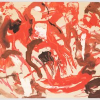
Our acquisition has a muted rust-red background which, because it’s paint and not merely colored paper, discloses faint wiggly borders from the application of liquid gouache. Atop the field lie black, orange, Naples yellow, brown, and a couple of tiny blue shapes loosely associated by a few pencil lines that read rather as telegraph wires. On the left side of the painting is the biggest shape in the picture, a right-angle configuration in tomato-soup red. It’s the same dark-light value as the background, so it’s simultaneously conspicuous and hidden. Counterweight is provided by an off-white, pointy capital “T” leaning rightward.
The geometry waxes delirious — a clothesline in a hurricane, or a microscopic version of The Raft of Medusa— but it also steadies itself in the manner of the sails and rigging of a sloop at sunset. It balances lovingly, and it fits right in with the best of Slobdokina’s underappreciated work. To our eyes and knowledge, the painting is just about perfect.
When the dealer arrived with it a week later, we immediately hung it on the clean white wall we’d prepared. This past summer, when we moved, we packed it more carefully than anything else we own. It continues to enjoy pride of place, now on a freshly painted wall immediately to the left of the desk on which this little paean is being written.

By the way, the title of our Slobdokina is — as Laurie was surprised to discover from the provenance labels on the back of the picture — The Red L Abstraction. Coincidence, I say dismissively even as my existentialist self pauses to ponder the way fate and fortune every so often link arms.
About the author: Peter Plagens has been affiliated with Nancy Hoffman Gallery since 1974 and recently had a series of collages on view at Texas Gallery in Houston. He writes a regular column about art for the Wall Street Journal.
Related posts:
Plagens novel: It’s just fiction
Agnes Martin: A resolutely solitary endeavor
Toughen up, lady
Art Fair Pick, 2008: Ruminating, speculating, and pontificating