

Contributed by Jason Andrew / Before the painter Pat Passlof, who died in 2011, would allow me to visit her in her Forsyth Street studio, she insisted that I join her and her Tai chi class held in the park across the street. “Sounds just like my sister!” exclaimed Aileen Passloff (Pat dropped the second “f” early in her career after discovering when signing a painting that she didn’t leave enough room for two), the noted dancer, choreographer and Bard College professor. “She was fiercely demanding about art and about everything else, really.”

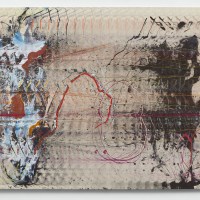
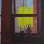
It was exciting that the first painting I encountered at her current survey at the Milton Resnick and Pat Passlof Foundation was the very same one that Pat had set aside for a show I curated. Titled Hawthorne and made in 1999, it is a stunning example of her distinctive talent. It’s well-chronicled that she studied with Willem de Kooning and was married to Resnick, and parallels are certainly decipherable in this exhibition. But it was Pat who straddled the canvas and directed the brush. While she was deeply connected to those figures, she was also a frimly independent artist. At last it’s exciting to see a major survey all within an institution that Pat built.
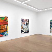
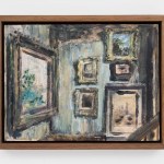
Curated by the venerable Karen Wilkin, the show fills three floors of Foundation. On each floor there is a non-chronological hang mixing the decades and revealing the diverse directions of Passlof’s nearly eighty-year career. For instance, on the first floor, fifty years separate one of the earliest works on view, Gulf (1949) from Hawthorne (1999). For those unfamiliar with Passlof’s work, this discontinuous approach to a survey could prove disorienting, even jarring. I found it liberating. The strategy does require patience. But, as Passlof said, “Painting is inconvenient. It is slow and may require a whole life.”
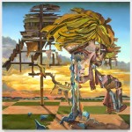
On the second floor, an untitled painting from 1995 greets us at the top of the stairs. It’s colorful, depicting a period when Passlof recorded dreams and explored myths. The painting features two horses with riders and one lone horse within a gestural landscape built up from bottom to top with painterly yellows, greens, and blues. A bright orange cloud reflects a setting sun. Aileen recently told me that before their father married, he was an officer in the mounted police. “My father rode six horses at once. He could pickup a handkerchief with his teeth — the horses all along galloping.” Aileen didn’t take to riding as Pat did. Perhaps Pat was teasing out an autobiographical lament: she rides with their father and Aileen’s horse waits for her to climb on.

In Untitled (1995-96), a harras of centaurs is densely painted as if etched into thick clay. It’s a remarkable painting that I remember as a highlight from one of Pat’s first exhibitions at Elizabeth Harris in 1996 (when the gallery was at 524 Broadway). Passlof paintings that feature horses and mythological beasts “challenge her own allegiance to abstraction with uninhibited improvisation,”explains Wilkin her catalogue essay accompanying the show.

Two epic works hang on opposite walls on the second floor. Each measures eleven feet or more and each is layered and orchestrated as if by a completely different hand. Sky Pasture (1961) is lavishly painted merely with a one-inch brush that meanders along the surface while wide, thick, truncated gestures undulate on Back to Back (1997).
One of the greatest lessons she learned from de Kooning was about “a leap of space.” Essentially what happens in collage, as she observed writing in a special issue of Art Journal celebrating de Kooning’s eighty-fifth birthday, “the surprise of discontinuity or displacement.” She seemed intent on cultivating that kind of surprise across her oeuvre, and it is this variation in palettes, structures, and strategies that most sharply separates Passlof from other painters. “The imprint of Passlof’s personality and convictions about painting is visible in all of her work,” writes Wilkin, “but it is equally clear that she had no single way of constructing a picture.”

The fourth floor is packed with some of my favorite works, like Promenade for a Bachelor (1958). Pat once told me the story that inspired the title for the picture. She and Milton adopted a large white pigeon that appeared at her studio window one day. They named it Morgan, as the bird’s profile reminded them of the financier J. P. Morgan. “From his bedtime perch on the stovepipe,” Pat recalled in Out of the Picture: Milton Resnick and the
New York School, “Morgan looked straight across the room at my painting wall.” One day the bird flew directly into the painting, “sliding down the six foot height of it and smearing inharmonious oranges, black and greens over his pure white bosom.” Later, when the painting was finished, the bird took to courting it, “bowing, crowing and fanning his tail” while strutting across the top of the canvas.

While Stove (1959) and Isosceles (1980) share a dominant color (blue) and both have narrative titles, Passlof’s approaches to their respective surfaces are very different. The brush movements are deliberate and measured in Stove. In Isoceles, they are more freely gestural, so as to build a layered surface. In both, there is an inner light, an optimism, a harmony. But Stove plays Stockhausen while Isoceles plays Beethoven.

Another breathtaking blue painting, Hells Zapoppin’ (1990), back on the first floor, draws its title from the musical Hellzapoppin’ that ran on Broadway from 1939-41. The film adaptation produced by Universal Pictures in 1941 features a five-minute long dance sequence consisting of flips, slides, kicks, splits, and lifts performed by Whitey’s Lindy Hoppers. Passlof, who likely saw the original on Broadway as well as the film, packs everything she knows, sees, and feels into a the 45-inch width of the painting, which incorporates an inset of double-directional raking diagonals. She makes the paint move left and right, up and down, across and back. It syncopates, dances, and sings.

“A work of art is more like a feather than a boulder,” Passlof said, “but that feather, truly aimed, has the power to scatter, perhaps undo, assumptions, to move, (change) us.” This pretty much sums up the mindset that informs her every mark and move.
Watching Pat practice Tai chi, I took in her strong stance, feet shoulder-width apart, hips slightly tucked, toes pointed straight ahead, her measured breathing. I imagine she approached painting with the same kind of poise, taking re-inventing breaths between each work. “A painting must be still,” she stressed to her students, “the stillness of a breath held at the apex of a leap.”
Passlof may not have been known for the originality of her technique. But recognition for her distinctive acrobatic mastery of the painted mark, admirably showcased by this exhibition, is deservedly growing.
“Pat Passlof: The brush is the finger of the brain,” Milton Resnick and Pat Passlof Foundation, 87 Eldridge Street, New York, NY 10002, thru April 12, 2020.
About the author: Jason Andrew is an independent scholar, curator, and producer who co-founded and directs Norte Maar, a non-profit organization that creates, promotes, and presents collaborative projects in the arts. He can be followed on Twitter, @jandrewARTS.
NOTE: Today is the FOURTH (!) day of the 2019 Two Coats of Paint year-end fundraising campaign and we are well on our way to making our 2020 goal thanks to the generous readers who have already contributed. We hope to generate enough revenue to offset rising costs for web hosting, design, newsletter service, editorial help, and contributors’ honoraria. If you value what we do at Two Coats of Paint, please consider supporting us for another year. New limited-edition canvas tote bags are being screen-printed and will be given to the first 100 readers to contribute $150 or more. –> Please click here to contribute.
Related posts:
Image of Pat Passlof
Toughen up, lady
Joan Snyder: The female presence


Thank you for your wonderful review which I mostly agree with. I was a student in Pat’s first college class in 1971. She was an inspiration, changed my life, and we remained close for the next 40 years. I curated several shows that she participated in and was a colleague later at the College of Staten Island where she taught. I can tell you that she would never use the word “technique” to describe what she did as that implies too much premeditation and a set way. Pat would not say or do anything that smacked of a system.
Brialliant essay.
Can’t wait to see the show.
So precise and full of wonder.
Best,
Ara