

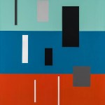
Contributed by Erin Langner / When I walked into Season last week, I almost stepped on Summer Reading, a painting by Michael Ottersen. To be fair, the painting was on the floor. At 18 x 21.5 inches, it was also around the size of a doormat. But, the tilted, pink line that slices through the midsection of the chunky, yellow painting stopped me in my tracks as I entered the gallery to see the show of ten paintings and works on paper titled “Free Dirt.”

Summer Reading embodied the heated conversations that happen between the bold colors and minimal forms throughout Ottersen�s work. Its borderline-bubblegum pink looked as though it was trying to be refined, but with limited effect. Its rigid sides cut hard and fast against the mustard yellow�s opposing, unashamed gloppiness that dominated the rest of the wooden panel. As I stood beside it, I felt as though I were watching an argument unfold, albeit the lighthearted kind that belongs to an old couple who know each other�s differences but continue to banter out of habit.

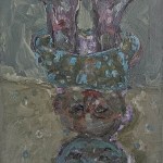
The nearby, wall-mounted painting Famous People in Bed was covered in a slicker surface that emanated enthusiastic, harmonious tones, more like the sound of a buzzing crowd at raucous party. Moving closer to the piece revealed a nuance found throughout the exhibition: the tiny threads of color that break through edges, where colors meet or where a painting�s border ends. This element can seem like a minor detail but reveals the artist�s deeply considered layering of paint.


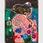
Ottersen explained his process of burying his color experiments and revisions within each piece as a �complicated way of pursuing a simple thing.� Yet I found any sense of simplicity tended to fade quickly as I experienced each painting�particularly when I spent time mulling over their titles. The orange and blue shapes that fill the large-scale Rest Area provoked my own, internal conversation as I tried to reconcile the title�s words with the painted forms. The left side of my brain wanted to find a literal manifestation of a rest area against my right side�s refusal to force a context into an image where it didn�t visually exist.

The space between the tensions in Ottersen�s paintings�between loud and soft, complication and simplicity, logic and intuition�is where “Free Dirt” sits, and is one where I would happily remain stranded for days, until someone came by to take me away.

“Michael Ottersen: Free Dirt,” curated by Robert Yoder. SEASON, Seattle, WA. Through December 31, 2016.
About the author: An art worker based in Seattle, Erin Langner works at the University of Washington’s Simpson Center for the Humanities and has held previous positions at the Seattle Art Museum and Henry Art Gallery. She has written for ARTnews, Hyperallergic, The Stranger, and the New American Paintings blog and is at work on her first collection of essays.
Related posts:
What�s so strange at Fredericks & Freiser�s �Strange Abstraction�?
Geometric Abstraction update in DC
Peter Halley: Hyperreal


Beautiful paintings… glad to be introduced to the work. Also … liked the writing… honest & personal…