Rob Kaiser-Schatzlein / I met Carrie Moyer in her new-ish Long Island City studio. The space is generous, and it’s her first studio with north-facing windows. Moyer knows that artists and northern light are clich�s, but she concedes, with some surprise, that she does love the quality of the light. Containers of bright acrylic paint are everywhere, and a small but impressive art book collection sits on the shelves.� After I saw installation shots of “Pirate Jenny,” her 2013 solo show at the Tang Teaching Museum at Skidmore College, I wanted to know more about her work. The paintings were totally abstract–handsome but challenging and mysterious, and I had some trouble deciphering her cues. She is a sophisticated painter, interested in the history of art and its social and political implications, which she combines with what she would refer to as “jokes about painting.” But it was also clear that Moyer wanted viewers to understand them. She had set out a furry rug and bean-bag chairs, signaling a genial determination to communicate. Moyer brought the same expansive attitude to our conversation.
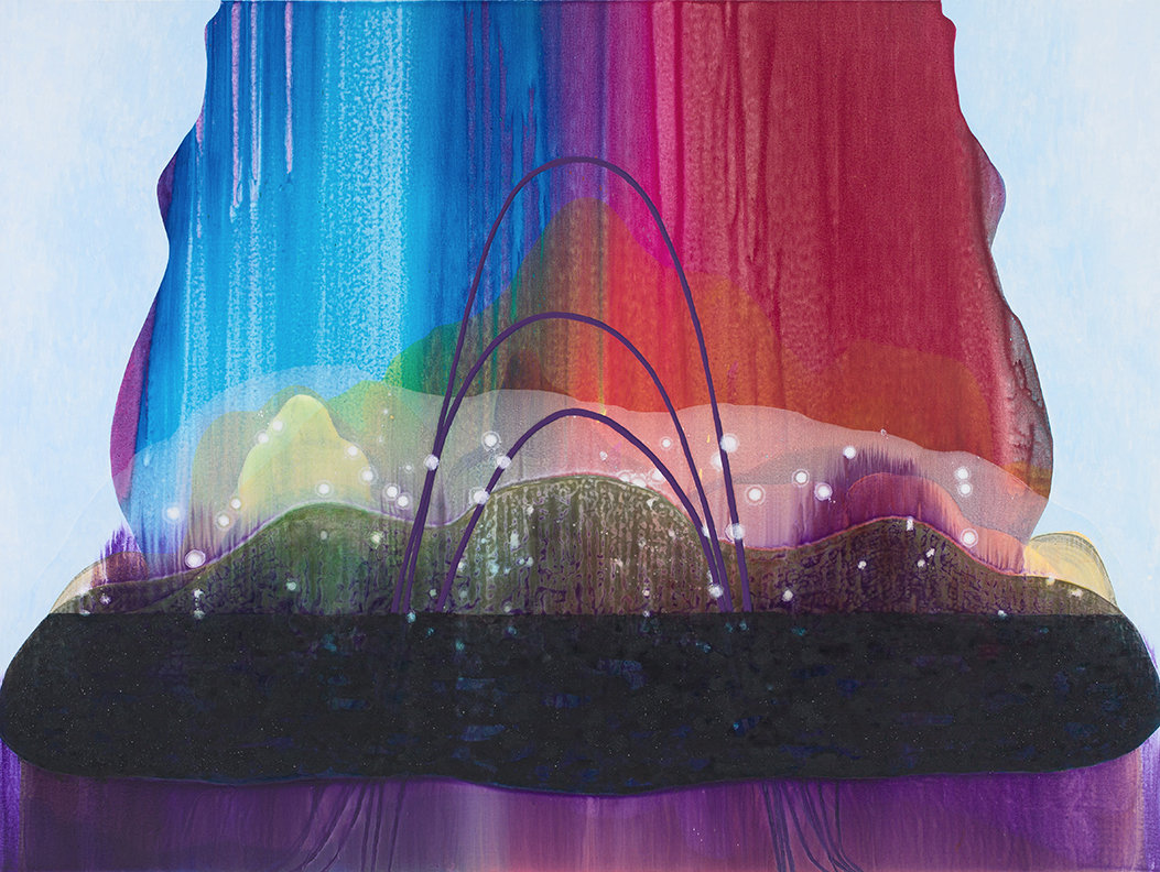
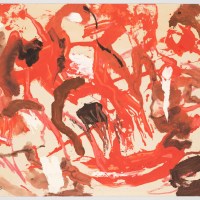
[Image at top: Carrie Moyer, Cloud 9, 2016, acrylic, flashe and glitter on canvas, 72 x 60 inches. Images courtesy of DC Moore Gallery, New York.]
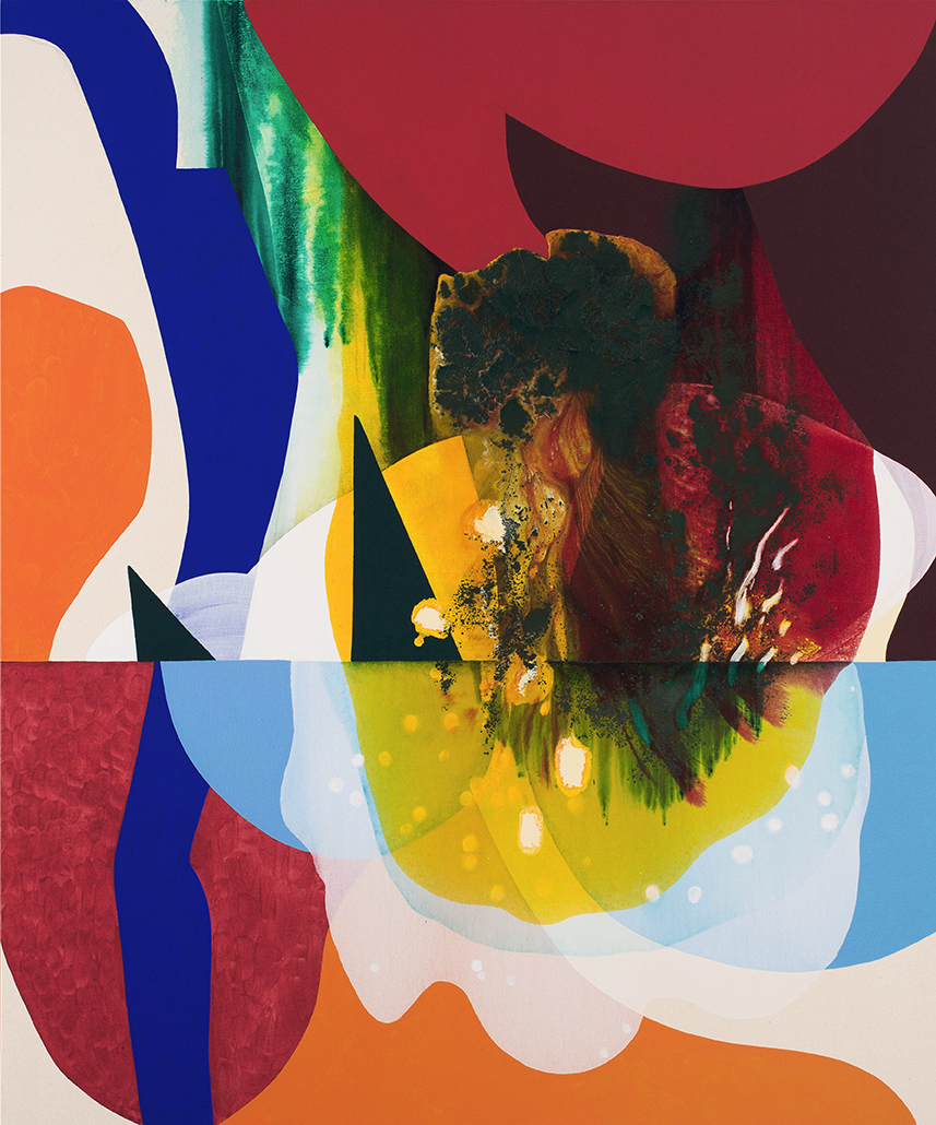
Carrie Moyer, Viene Qui Bella, 2016, acrylic, flashe on canvas, 72 x 84 inches.
Rob Kaiser-Schatzlein: What�s the most recent painting you’ve done?Carrie Moyer: This one is, let me take it off the table [Cloud 9] and put it upright so we can look at it. This is how I start everything, I make these little collages [she pulls out an envelope with postcard size collages that are covered with packing tape to secure the cut shapes of colored paper]
RKS: Every single painting is made from one of these collages?
CM: A lot of them. This is a painting [on her computer] that is going to be in the show. As is this one. I make collages and then I cut things out. Some are two collages that are put together. I cut some in half and I swapped out parts. The collages are to basically give me a sense of structure, it has nothing to do with color.
RKS: Structure as composition? CM: Yeah they’re the same word in my language. I set up these areas of flat color that become shapes that interlock and break apart as they move backward or forward in relation to the picture plane.
RKS: So how they are overlaid in the collages doesn’t get referenced in the painting?
CM: Usually that is how it goes. This painting weirdly is pretty close [Cloud 9,�the one she took off the table]. A simple way to look at the process is that I set up these blank areas to pour into. It’s balance between graphic areas and these diaphanous areas of poured color. This painting has an area that was a puddle of paint that took three days to dry.
RKS: This is all acrylic? Has it had anything else added to it? [the poured area she just referenced]
CM: It has glitter but it doesn’t look glittery it looks more like a growth or a scab. I’m not interested in the viewer knowing the story of how it got made, I want it to just appear. I am purposefully pulling things from the back forward so�that the viewer can�t read the process.
�
RKS: Are you purposefully interrupting the viewer’s ability to figure out how it was made?
CM: I’m not interested in having something where the viewer can say what is the background, and what happened on top of that, and in what order. I’m interested in mixing that up. Since a lot of these will be done on raw canvas, having the sections where the raw canvas exposed in the final piece is a dumb joke about painting because it really is the background.
RKS: Do you grid out the collage with pencil? I see one of these collages has a grid on it. CM: Sometimes I do and sometimes I don’t. I must have used this in something else and gridded it out, because I didn’t do it to the top part of the collage. It depends, mainly on how much I am trusting my sense of scale at any given moment.
RKS: How faithful are you to the structure of the collage? CM: I’m not. These three paintings that will be in the show are probably uncannily close to the collages, but the collage is just a device to get me going. I just need something to set up what’s going to happen. In a funny way, it is more about having some graphic reality to sort of screw around with �and decide where things are going to sit spatially. �Once I do the drawing I stop looking at it.
RKS: You draw it with pencil and a ruler?
CM: Yes, with a graphite pencil. Before I became a teacher I was a graphic designer for many years. There is this innate sense geometry in my work and wondering maybe “Where’s the center of the painting? I’m going to measure that.” So there are a lot of things in these paintings that you would use in a design shop.
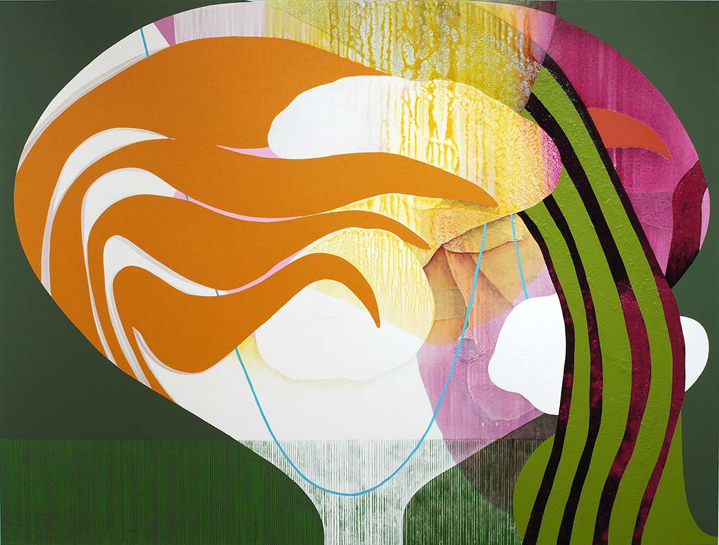
Carrie Moyer, Candy Cap, 2016, acrylic, glitter, flashe on canvas, 72 x 96 inches.
RKS: Do you ever fight that? CM: I had a hiatus between undergrad and grad school where I stopped painting for a few years, and thought I would do public art. I had started working in advertising production. At the same time I was really involved in queer and feminist activism and making agitprop posters. Eventually I went back to painting. I missed being alone in the studio and making things by hand. Also I didn’t want to make art by committee anymore. When I returned to painting, I had an aversion to graphic imagery or anything vaguely design-y. I still use Photoshop once I get towards the end of a painting, to check what the painting will look like small, or fiddle around with the composition if things aren’t working. At the point when I started painting again in earnest, graphic design represented how I made my money and the studio represented a place where I could just be free. Eventually I realized these different locations and languages were all just tools.
RKS: Can you think of a problem in your painting that you resolved? CM: I did take a photo of this one [a painting that has, since the time of the interview, been abandoned] to show my gallerist and this poured part had to be taken out in Photoshop. It’s just not working. But I haven’t fixed that yet because I usually have three or four things going at a time. Sometimes in order to not kill something I have to leave it alone.
RKS: Will you change your mind? CM: I will definitely change my mind. Setting paintings aside or looking at them on the computer screen is a way to slow myself down � so I don’t go down some crazy rabbit hole and make one bad move on top of another in my desperation to “solve” the picture.
RKS: Why isn’t this part working?
CM: Because it’s so symmetrical right now and�the two parallel forms are making the composition too rigid. I’m playing with some new ideas�which there will be�a lot of examples of in this show�where I have the viewer look through things. In this painting [Yellow Umbrella]�I have these bars or whatever they are, that could almost be stereoscopic. So this stain I want to eliminated because is almost redundant, but this is a very complicated picture so I’m going slow on it. I am really interested in symmetry, it’s something that has been in my work a long time.
This painting over here is related to that one–�Viene Qui Bella.�I was just in a show at the Everson Museum in Syracuse, which has an incredible ceramics collection. I was looking at a lot of �great Modernist tabletop sculpture and using images of the ceramics. These are some pictures I took from their collection. For the show�Polly Apfelbaum,�Tony Feher, �and I were asked to use the collection as part of our installation. I didn’t end up picking any ceramics to show, but I did spend a great deal of time looking at these incredible forms. I’m always interested in forms that are abstract but biomorphic or suggest the body in some way. Ceramics does that really well.
RKS: How does this painting relate?
CM: Viene Qui Bella�has an image related to a sculpture that becomes a scaffolding to hang things on in the painting. This is the sculpture [showing me on her computer, a ceramic piece The Orator by George Stark] and it satisfies these things that I am interested in: it’s abstract, it’s kind of decorative, it’s also figurative, it’s pretty sexy, it could be a person making a gesture, it also sets up a form that I play back and forth with. Once it made it into the painting, the form became very flat, so it starts to look almost like a logo.
I have two versions of Viene Qui Bella. They’re both unfinished. I haven’t figured out the bottom of the painting, as you can tell. You’re seeing me test out all these things!
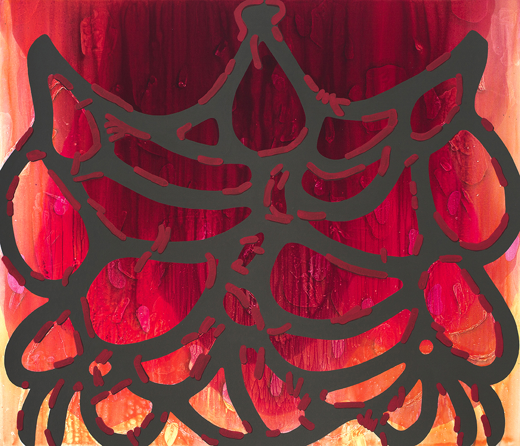
Carrie Moyer, Conflagration With Bangs, 2015, acrylic, glitter on canvas, 72 x 84 inches.
RKS: How much testing do you do?
CM: It might take me three or four days to figure out a color. I just keep changing the color. Again, this painting [second version of Viene Qui Bella]�is pretty complicated so I need to test a lot of it. I can’t just put a dab and go “Oh yeah that’ll work.” I need to paint out a lot, like with this gold color. But I still can’t decide what I think. I have paintings that work at different speeds, this painting I have worked on for a couple of months. This painting with its back to us is like a week and a half old and it is almost finished. It depends.
RKS: On what?
CM: On what happens. [laughs]
RKS: You don’t get to will it into existence? CM: I feel like if I am too formulaic about it, then I lose interest. If I can imagine the painting before I paint it, it’s not going to be an interesting painting. I need to figure it out as I am making it, and be surprised by it. It would become too illustrative to me, because I am making these material discoveries every time I am making a painting. Things I didn’t know the paint can do. That requires having a lot of room for surprises and moments where I am not sure what is going to happen.
RKS: On this painting, there is a poured area that transitions to a hard edged shape, was that a discovery you are talking about?
CM: The background is multiple pours of very gauzy color with varying amounts of water in it. The front, which is this form, was on the canvas before I started painting. In this version I am pulling it forward again, so it can be in dialogue with what’s behind it. This stuff in the “front” is Flashe, so it is very matte and really different than the acrylic in the back. I have thought a lot about and been associated with color-field painting and it’s processes and been in some shows that have focused on [Helen] Frankenthaler. I am as interested in disrupting the clich� ideas surrounding color field painting as I am in staining and pouring. �Pouring is not necessarily an intuitive tool.�By amalgamating different applications processes�it’s not only a�nod to history but also how different kinds of paint application read. You can recognize a�Morris Louis�painting because the graphic shape of his pour � especially with the �Unfurled� series � is seared in our brains. There is a symbolic value to the shape of the paint itself. Then there is the act of pouring which is very process-y. There are a lot of mental gymnastics in my painting!
RKS: How do you know when the color is right? CM: The color is decided through simply looking. The poured part is a smooth gradation but here I am not going break that down into a gradation, maybe average the value and hue in different places. The reason this is this color right now is because it felt like I needed to make a kind of channel where I let some air in here. That’s the best I can do to explain it.
RKS: How do you know when you are done?
CM: I know they are done when I lose interest in them. When I am not grinding in my brain about how to solve them. A lot of times I’ll spend most of my daydream time picturing the paintings and solving them in my head. Once that goes away for a particular painting, that means it’s done. With this one, I know what I have to do to finish it. I already did all the mental work and now I know the next ten moves I need to make to finish this one. Then I’ll reassess. This will be flat, no brushwork.
RKS: You have varying degrees of brushwork, will it all stay?
CM: Yes.
RKS: Do you stretch many canvases at once? CM: It depends on the show. The show that I had in Syracuse recently was in this very large I.M. Pei building, so I ended up making a painting that is seventy-two by ninety-six, but I have a rack full of unpainted canvases.
RKS: Do you have an assorted blend? I see you have some small ones on the wall here.
CM: I’m not the best at small sizes. I tend to overwork the surface and cram too much stuff in� even though small paintings really don’t need that much stuff. I’ll show you a small one I did recently called Night Train. I’m always interested in scale and size so when we look at this painting here without knowing what size it is, it could be a very large painting. It’s spacious. I basically have big, super sized, and normal-sized which is sixty-by-seventy-two and then smallish ones. They are my challenge to myself. Figuring how much punch can I get out of this without working it to death.
RKS: Are they all taped along the edges?
CM: Yeah, they’re all taped.
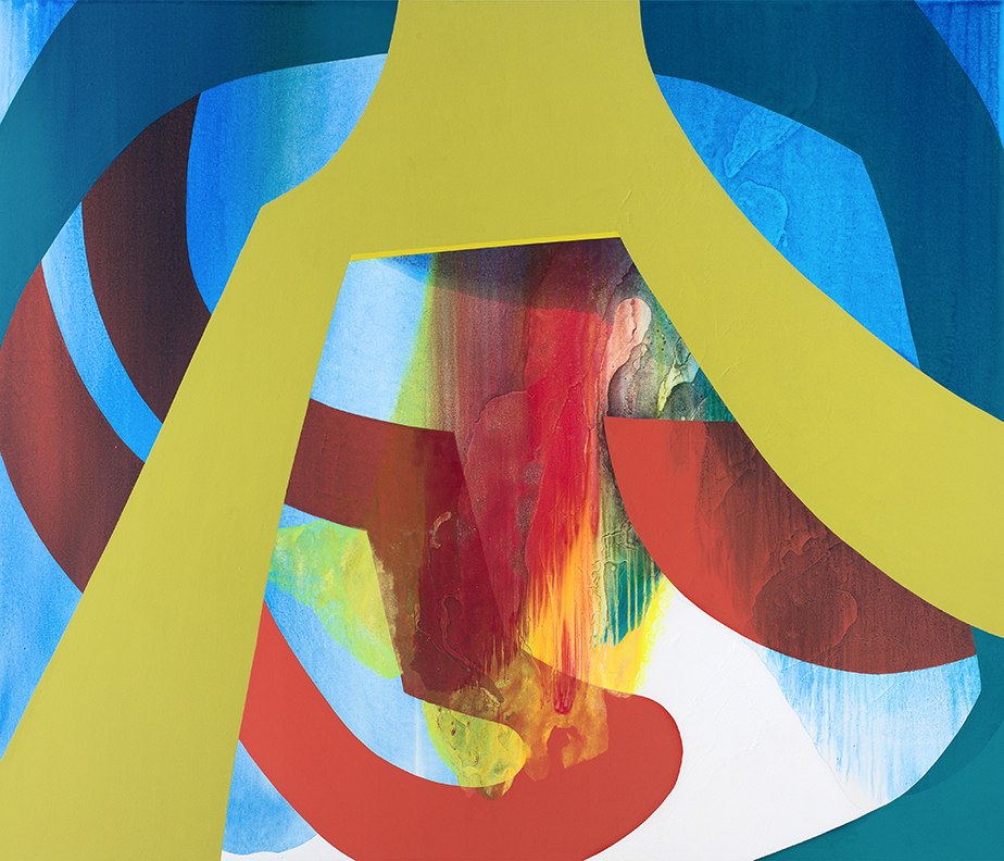
Carrie Moyer, Intergalactic Emoji Factory, 2015, acrylic, glitter on canvas, 72 x 84 inches.
RKS: Are they all gessoed?
CM: For many years I didn’t prime them at all and I would just put a little matte medium on them so they didn’t get yellow or saggy. Now I am going back and forth between pre-primed and not. Mainly because I am interested in a sense of light each surface creates. Like this one [Viene Qui Bella] has this intense glowing light. You would never get that on a raw canvas, because you don’t have this white light source in the back.
RKS: How do you vary the lightness of the paint?
CM: It’s all about water. About how much water goes in it. It doesn’t even look like it in here [the studio] but there is often a huge puddle covering the floor.
RKS: That’s why you have a table to lay the paintings down on.
CM: Yes, the paintings are constantly going back and forth between the table and the wall. I’m not so interested in a virtuosic brush mark, I’m more interested in setting up this relationship between atmospheric color and these hard-edge flat shapes. I went to art school in the mid-1980s, so I grew up in the era where having a signature brush mark is very suspect for all sorts of political and theoretical reasons. Even though I adore gestural painting. It is one of these primary fallacies that technique is built on: that you are going to develop your own signature brush mark. Well, the truth is paint can only do so many things.
RKS: So when you do have a brush mark, it is more of a repetitive thing.
CM: I do have some paintings with some more brushy parts but it is something that I have slowly warmed to. I don’t think younger artists feel this way. I was one of those weird psychic burdens of coming of age as a painter in the nineteen eighties. We didn’t want to believe in this genius equals signature brush-mark equals originality. We wanted to find other ways of arriving at originality.
RKS: There are parts in these paintings where you have taped off parts right?
CM: Yeah, definitely. There is taping and then there is bad painting over. I’m not really worried about that stuff though. I’m interested in having a harder edge, but if you see the detritus of the tape, that’s okay. �A lot of the paint I use is extremely watery so it tends to seep under and leave interesting marks.
RKS: Is there ever a painting that you can’t save?
CM: Oh yeah, there are tons of paintings that I don’t use. But I don’t paint over them because I don’t want to see that other story. I’m not interested in the pentimenti or that stuff that is left over. I just had six canvases restretched. They have a clock. If I can’t solve them in six month then I get them out of here. Sometimes it’s just a piling up of bad decisions, and then I just need to clear the air. I’ll wave my sage over it and start again.
RKS: Will you start with the same collage?
CM: No. I do not use them again. So this is very unusual to have two painting that are related like this. And that might be one of those fake rules that used for myself that I don’t need anymore. I might not need to reject the idea if I didn’t figure it out on the first pass. There might be ideas that need two or three paintings before I can solve the idea.
RKS: Any other materials?
CM: My work is extremely simple materially, it’s just acrylic paint and water. I know enough about that chemistry to make it work and not have the paint totally fall apart. Also I have used this material for twenty years or something like that. It is just something that I know in my gut, not intellectually.
RKS: When do you work?
CM: I tend to be a night owl. Unless I�m teaching, my day starts a few hours later than the rest of the world. So I usually get to the studio around noon. Around 2pm things really start to click and then I�m off, immersed for the next seven or eight hours. I always leave myself an hour on either end of a studio day to move in and out of “painting brain.”
RKS: How long did it take to make these four paintings?
CM: The two paintings [Viene Qui Bella and Cloud 9] below took around three weeks each, but I was working on them simultaneously. �The other two [Yellow Umbrella and the first pass at Viene Qui Bella) were put on the back burner, perhaps never to see the light of day.
Two Coats of Paint is licensed under a Creative Commons Attribution – Noncommercial-No Derivative Works 3.0 United States License. To use content beyond the scope of this license, permission is required.
NYC Selected Gallery Guide, June 2026Contributed by Sharon Butler / In June, in the wake of an exhausting month of fairs, NYC galleries are again presenting a full slate of exhibitions. A...
April Gornik’s unsettled landscapesContributed by Rebecca Allan / In “Liminal States,” Miles McEnery Gallery presented recent paintings by April Gornik, juxtaposing five of her familiar...
AAA at 90: Keep on lookingContributed by Leslie Roberts / The exhibition “Abstract by Definition” at Art Cake celebrates the 90th anniversary of the American Abstract Artists (...
American Abstract Artists in the 1930sContributed by Jacob Cartwright / In 1957, Clement Greenberg penned the essay “The Late Thirties in New York,” reflecting on years that were formative...