

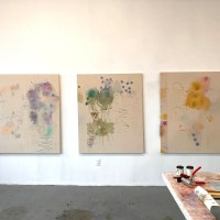
Contributed by Jonathan Stevenson / Though skewed towards this century, the paintings in Lennon Weinberg�s elegantly expansive group show �A Few Days,� from all twenty of the painters the gallery has represented since it opened in 1988, range from 1957 to 2014. In terms of style and school, they are not thoroughly cohesive, embracing as they do geometric abstraction, gestural abstraction, realism, still life, seascape, and more. But one shared feature that brings them together is the fine balance that each artist strikes between restraint and abandon � his or her sense and sensibility. On this evidence, it is the gallery�s commitment to maintaining that balance writ large that has enabled it to weather the turbulence of the New York art world while nurturing artists of lasting moment over the course of 27 years.
[Image at top: Stephen Westfall, Jerome, 2006, oil and alkyd on canvas, 60 x 60 inches.]

Anchoring the show are Melissa Meyer�s resplendently gestural Walk the Line (2011), and Louise Fishman�s solemnly inert Ecce Homo (1990), densely painted in black and brown. With her customarily effusive brushwork, Meyer conjures the vital if daunting thrall of the human dance. Fishman, by contrast, seems to behold a species hindered but not beaten by worldly interference. Each painting seamlessly records both existential strife and celebration of life, though in alternative calibrations. Other works that vividly explore that tension � essentially, between endeavor and incapacity � include Carl Palazzolo�s Tears of Things #1 (2012), which conveys the frustrations of seeking order; Stephen Mueller�s hard-edged, ambiguously kinetic Kalki (2010); Denyse Thomasos� Life (2009), which reflects the paradoxical chaos of contemporary sophistication; and Michael Goldberg�s Earthstopper (2001), intimating that surface noise obscures deeper meaning.
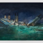
Among ostensibly more traditional works of recorded observation, Chuck Connelly�s Still Life With Fruit (1997) is ironically a very lively, irresolute painting on account of the viscous appearance his wet-on-wet technique imparts to the canvas. Robin Lowe in Adrift (2007), Paul Waldman in his seascape diptych Untitled #9 (1999), and Catherine Murphy in Chimneys (1993) masterfully use the uneasy sedateness of the content depicted inside the canvas to prompt the viewer to ask what presumptively agitating phenomena lie off the grid, as it were.
Another category of paintings involves subtly manipulated content or novel processes. In Untitled #10 (1994), Alan Turner meticulously depicts vaguely familiar things � a saddle (probably) and a braid of hair (certainly) � in an off-kilter way and out of their usual context, to discomfitingly surreal effect. Roy Dowell takes a similar approach in Untitled #1057 (2014), but his tassels and concentric parallelograms add up to something more abstract and, interestingly, a little less psychologically disruptive. Tony Berlant, by fastening his collage to wood with a tight array of steel brads for Pleasure Point (2005), and Peter Davis, by squeegeeing glossy red house paint over aluminum for his untitled 2004 piece, cleverly impose offbeat procedural discipline in the service of distancing themselves from the object and liberating content. And they arrive at what look, rather diabolically, like found art objects that some other artist � perhaps more of an outsider � might have made.
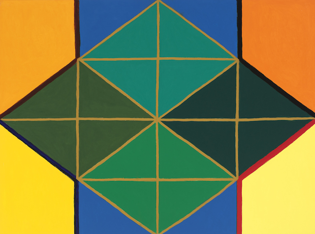
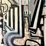
At the level of the object itself, Harriet Korman�s Untitled (2013), Stephen Westfall�s Jerome (2006), Richard Kalina�s Pondicherry (2004), and Bruno Rousselot�s Concorde No. 60 (1998) � all immaculate geometric abstractions � in very different ways manifest the artist�s arduous drive to integrate order, beauty, and a kind of measurable or observable progression.
Two small, untitled Joan Mitchell paintings from 1957 function as touchstones for the show�s control/impulse duality, their freewheeling brushstrokes moderated by precise, purposeful composition. Jill Moser recapitulates the effect 57 years later in Mirroring Mist (2014), while Meyer�s tempering of her gestural impetuosity with discreetly and carefully modulated shapes and brushstrokes links Mitchell�s work with the hard-edge strictures followed by Westfall and others near the opposite end of the abstraction continuum.
The title of the show comes proximately from a Mitchell series, inspired by James Schuyler�s sublimely mordant poem �A Few Days.� The poem begins:
A few days
are all we have. So count them as they pass. They pass
too quickly
out of breath: don�t dwell on the grave, which yawns for
one and all.
To heed those words by balancing sense and sensibility, this extraordinarily fine exhibition suggests, has been and always will be the painter�s vocation.
“A Few Days,” Lennon Weinberg, Chelsea, New York, NY. Through December 19, 2015. Check out the exhibition catalog here.
Related posts:
Melissa Meyer’s FASCINATION
Artists who curate: “Creating opportunities for felicitous constellations”
Last chance: Julian Pretto’s artists, at Minus Space
——
Two Coats of Paint is licensed under a Creative Commons Attribution – Noncommercial-No Derivative Works 3.0 United States License. To use content beyond the scope of this license, permission is required.


Is Stephen Westfall colorblind?
While I know that color is very personal, his color combinations are awful.
The COLOR–that's what I love about this painting. Is there such a thing as "awful" when it comes to color? The colors here evoke a certain mood–they aren't lovely, right? but they have a sublime beauty.
Some of Westfall's color choices may seem odd, but, as Turner says, color is very personal–and, in Westfall's case, I think very purposeful. One point I suspect he is interested in making with his work is that color functions not only to woo the eye with beauty but also, in conjunction with line and shape, to establish order. What may seem like awkward or jarring combinations amplify this less glamorous aspect of color's visual role.
For me, his palette is a fresh and almost dimensional complement to the geometry.
Hi Shelly,
I didn't say that the color was awful, I said that the color "combinations" were awful.
There is a difference.
I love color!