
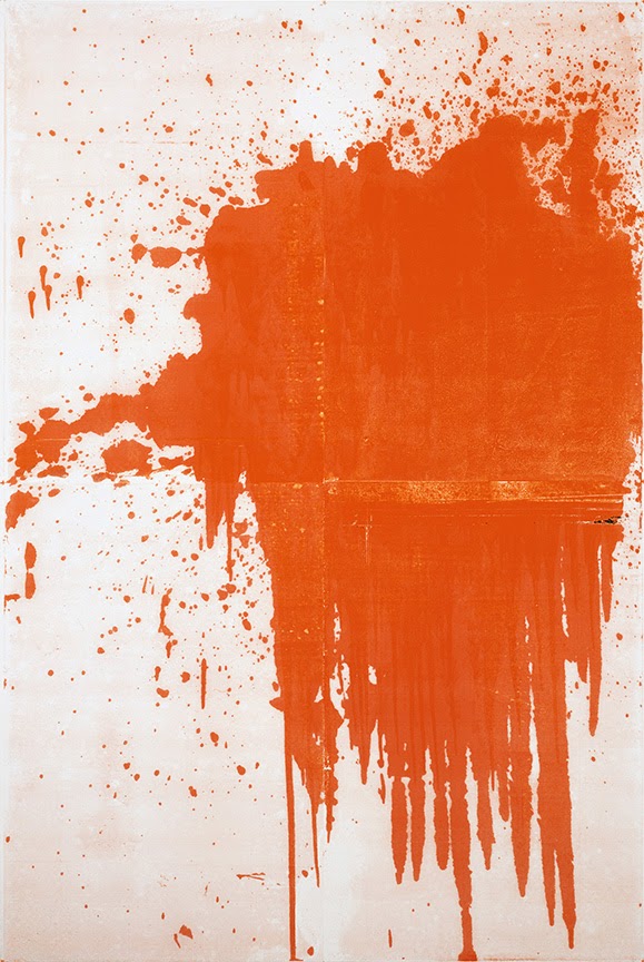
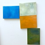
Christopher Wool is obsessed with doing things wrong. In his retrospective at the Guggenheim, comprising nearly 90 paintings, photographs, and works on paper, Wool demonstrates that meaning resides in mistakes (intentional or otherwise), disappointing outcomes, decay, and uncertainty. Appropriately, the show kicks off with a painting called Minor Mishap from 2001. Although in most of the paintings in the show Wool�s palette is limited to black and white, this piece features an ostensibly impetuous splash of red paint. Closer examination reveals that this bright splash is carefully contrived, generated by enlarging an image of an image � which amplifies a half-tone pattern � and then silk-screening the resulting image on linen. The result (or at least one result) of his work is the fusion of the emotional content of Abstract Expressionism with the humor of Pop Art, the reprographic processes of the Pictures artists, and the nihilism of the 1970s punk music scene.
Sometimes labeled an endgame painter, Wool, to the contrary, breathed new life into painting in a time when it seemed weary and under siege. In an epoch when older painters tended to work for forty years exploring the same image, Wool blew willy-nilly through different images, often concurrently, challenging traditional notions about artist identity and branding and paint handling as well as the Modernist notion of progress. Accordingly, the exhibition has a slightly jangled chronology, darting from one date to a later one and then circling back and forth, illuminating Wool�s disinclination to work in a strictly linear manner. With the rise of Minimalism, performance art, feminist art, punk, and related cross-disciplinary influences, many considered painting pass�. Rather than embrace a more fashionable medium, Wool incorporated the punk movement�s iconoclastic anarchy and sarcasm into painting. Whatever one thinks of his taste and particular aesthetic, in making abstract painting meaningful when it seemed irrelevant, he was a true champion of the medium.
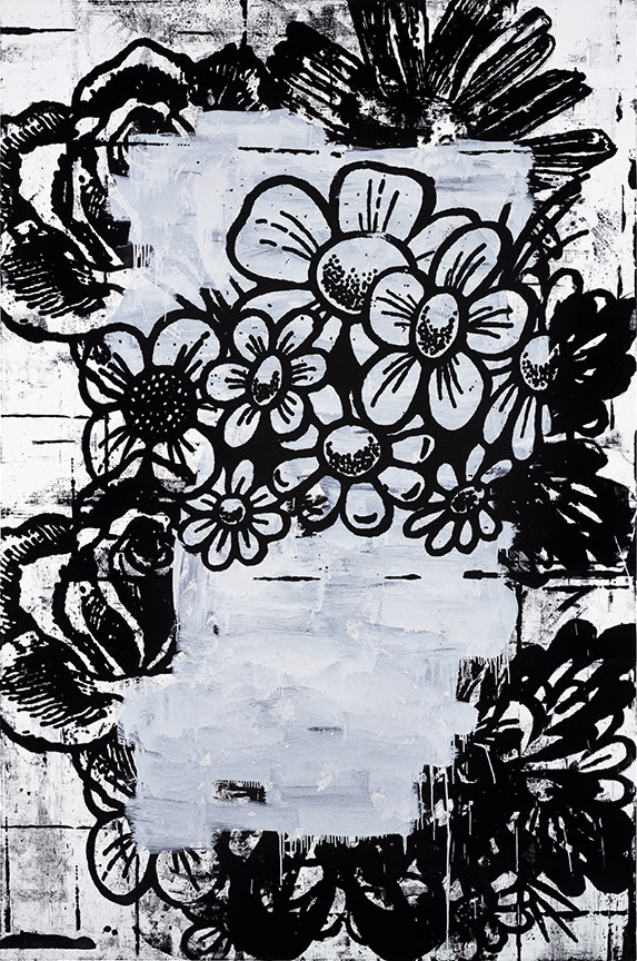
Yet to Wool himself, this quietly heroic role seems almost incidental. Compelled to paint, he was interested less in preserving painting�s place than in simply employing the language of abstraction to limn the messy contradictions, complexities, and challenges of life. Furthermore, what Wool chooses to paint (flowers, splashes, half-tone dots, images from a how-to-paint-abstractly book, and so forth) isn�t as important as how he uses each image, process, or tool that he gloms onto, incorrectly and haphazardly, the way punks adopted safety pins. For instance, in his text paintings from the late 1980s and early 1990s, Wool ignored the traditional rules of typography, defiantly obscuring the words depicted. His transgressions included eliminating traditional word spacing, using odd line breaks, omitting vowels, and aligning the letters on a grid regardless of each letter�s width.
Some critics have suggested that the show seems padded, including too many photographs, too many �gray paintings� from the later period, and not enough early work. And I admit that when I first saw the show, I thought the late work in particular had a grating redundancy to it. Upon revisiting the exhibition, I decided that the late paintings, early photographs, and book projects were central to understanding Wool�s vision. Born in 1955 and raised in Chicago, Wool moved to New York in the 1970s, when the city was collectively despondent and on the verge of bankruptcy. As a product of that gritty milieu, Wool was, and remains, moved by the urban decay and smitten with the Xerox technology of that era. In printing his photographs, he didn�t try to mimic the aesthetic of fine art photography but rather showcased the limited tonal range and the dirty artifacts that Xeroxing created as poignant reflections of a grimy city. The grayed-out palette and the clotty blackness in the later paintings stem from the aesthetic of early Xerox technology. Wool used his camera like a sketchbook, the same way many artists use their cell phones and Instagram feeds, and the scenes he chose to document inform his work.
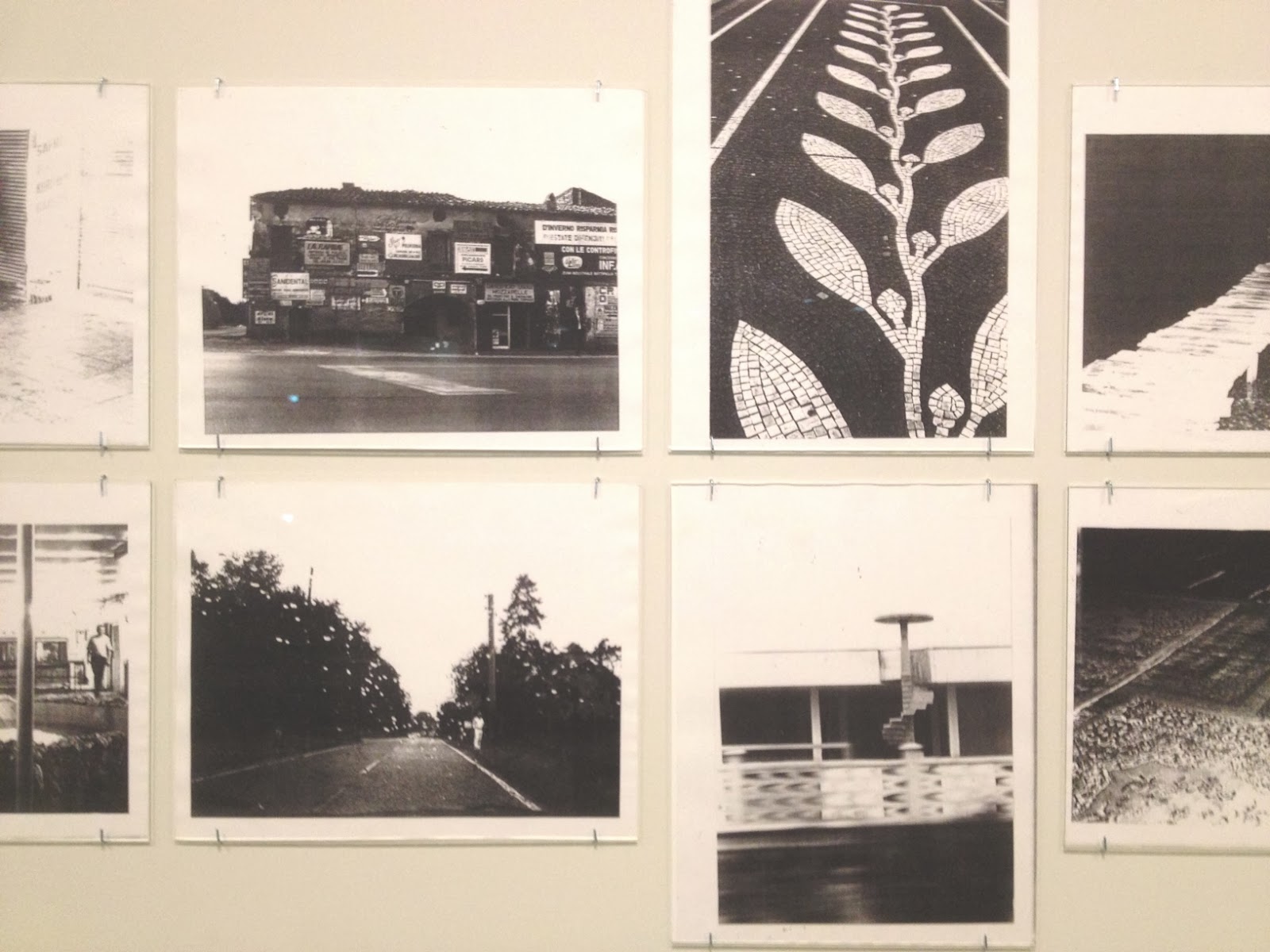
While walking back and forth to his East Village studio, Wool absorbed visual details that found their way into his paintings. In the 1980s, these included the artless but aggressive graffiti on the walls and subways. While this form inspired his use of spray paint, he neither bandwagoned on the bravura of the street taggers nor kowtowed to reactionary disaffection of the Minimalists. Instead, he relied on accidental spills and drips from indirect processes such as silk screening, stenciling, and rubber stamping to create an equivalent for the dirty imperfection of his Xeroxed images. Wool sprayed knotty squiggles that seemed limp and pathetic, and silk-screened images on top of one another while pointedly leaving unaligned registration marks in plain view. In so doing, he derived emotional and social content from the blight he saw every day � in my view, to powerful effect.
By the naughts, in the early gray paintings, Wool tried to work in a more traditional manner, by applying paint deliberately and directly to the surface. But he couldn�t go through with it. He wiped out the marks he had made using turpentine-soaked rags, leaving big swaths of washy gray and truncated black lines. Eventually, he started coming back into the canvases with white paint in a series of moves that highlighted his discordantly punkish combination of self-doubt and defiance.

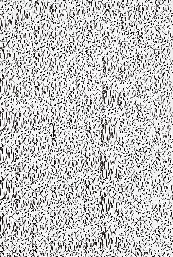
Christopher Wool, Untitled, 2010, enamel on linen, 243.8 x 198.1 cm. Image � Christopher Wool.
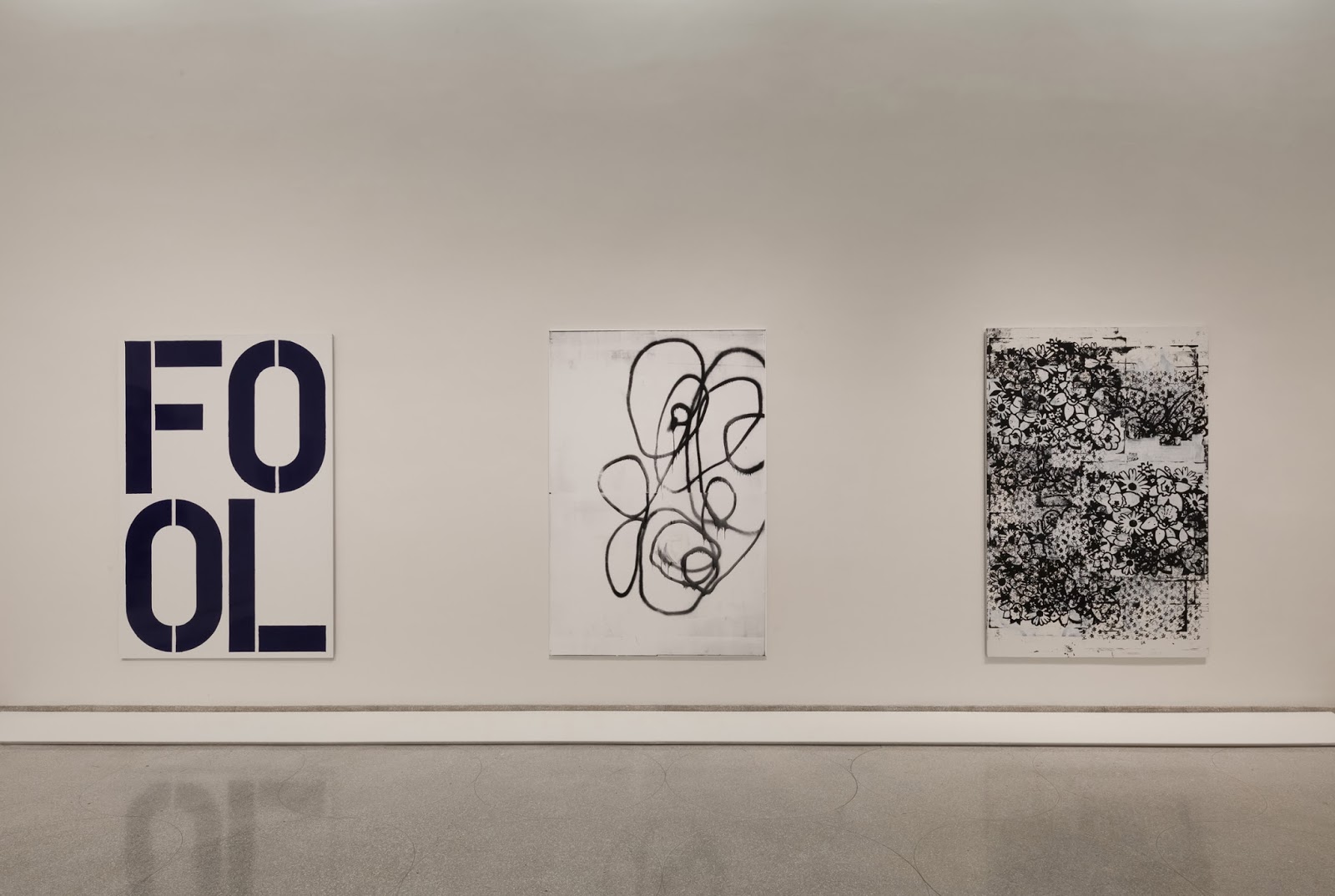
Most recently, Wool has taken up Photoshop to alter the images of previous paintings, a strategy that recalls 1980s Pictures artists like Richard Prince and Laurie Simmons. But of course, unlike the Pictures cohort, Wool has always used abstract sources. The last room of the show, at the top of the ramp, includes several mammoth paintings that incorporate images of previous work, silk-screened to large panels. Because Wool continues to mine the oversized half-tone dot, dirty edging, and the mysterious moir� patterns that resulted back in the day when Letraset half-tone film was laid on top of itself, the newer work seems nostalgic. I sense a longing for the old days of the East Village art scene, CBGB, and the days before the market took over the art world. Indeed, one of the paintings at the beginning of the show reads, �The show is over,� and I don�t think he is talking about painting. But even if he means to look back to his creative roots in that way, Wool�s application of new techniques to old tropes make the work more than just a wistful lament for a more vibrant, less vulgar art scene while registering continuity in art and in life.
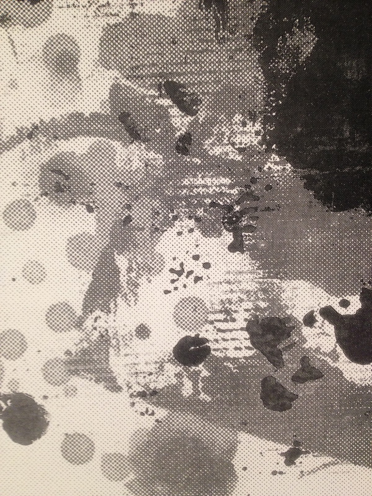
Christopher Wool, detail from a recent painting. Wool’s continued infatuation with the enlarged halftone screen is evident.

—–
NOTE: Two Coats of Paint is licensed under a Creative Commons Attribution – Noncommercial-No Derivative Works 3.0 United States License. For permission to use content beyond the scope of this license, permission is required.


Between Wool's raw ability as a painter and what I get from his artistic vision, I cannot figure out what the hell is so special about this guy. The late work reminds me of much more interesting prints by Charline Von Heyl. Maybe what I'm missing is a sense of poignancy in his word paintings, like "TERRORIST" at the Baltimore Museum of Art. They are neither interesting paintings or short poems in themselves, for me his phrases have never struck any particular chord. From those works, to the supposedly Baudelairean xerox'd photographs, it all comes across as very general to me, like a guy who stumbled into blog art years before it plagued twitter.
"Sometimes labeled an endgame painter, Wool, to the contrary, breathed new life into painting in a time when it seemed weary and under siege."
Sharon, the lineage of "painting" that emanated from Warhol certainly did seem weary. Wool did indeed extend that particular lineage. Other forms of painting have remained vital, but New York has largely ignored them. Those who truly care about painting find Wool a disappointment — I know I do — but they are looking in the wrong direction.
What I (and many others) value most about painting is its ability to embody a certain visual presence and attitude – which Wool has in spades. A lot of deadweight painterly mastery seems absurd next to the visual potency of Wool. Say what you want about Wool and the influences he has had, but stand next to one of his works and tell me that it doesn't have power to move the viewer in both positive and negative ways. Wool is just my kind of romantic nihlistic punk!
how does this guy's work get equated with punk? doesn't make any sense.
This is not punk. It's very cool (restrained) pomo formalism. It's not punk.
How can you not draw some comparison to punk? It's not literally punk, but it definitely has the attitude and the edge. Wool has always made his own work and the trends have followed him. By the way, if you wanna say something, why don't you actually say something – that's what really doesn't make sense!
I guess if whoever decides what punk is wants to say its not punk, then I guess that's your call. On the other hand, I tend to see the work operating on several levels beyond typical Postmoderism or whatever other academic BS you subscribe to. If you know anything about Wool, it's pretty clear that he's been deeply influenced by punk and if you have your brain connected to your eyes when you look at teh work, you can see it – albeit not in obvious ways.
It's not punk. What does it mean to say that "it has the attitude and the edge" of punk? That seems vague. It would not surprise me if the comparison to punk originated in some gallery or museum press release, and gives lax commentators and critics who have had very little real encounter with or context to speak from/about punk, to yarn some sort of transgressive 'meaning' for the work. Wool is a very cool kettle of formalist fish. There's the New York Studio School-ish 'wipe away' technique, but with spray paint. Then there is the Warhol/and Philip Taffe printed overlays, the stenciled bits of text ('the harder you look the harder you look' sounds like a play on formalist Frank Stella�), all of it a kind of Rauschenbergy slightly reconnoitered Ab-ex enamel inkjet onto sheets of aluminum. Gary hume is another painter who came to prominence at this time. With a few exceptions Wool works mostly in black and white. Maybe a dash of color here and there. It all asserts the flatness of the picture plane, very elegant, all up to date and channelled through photomechanical means, very museum program, academic pomo, but very not punk. Punk had nothing to do with any of that high minded seeming artfulness. It wasn't punk when we first saw this stuff in the eighties and early nineties, and no retrospective effort of specious commentators will change that.
Why so many anonymous comments on this post? If you're artists or writers, please leave links to your websites. Opinions are good–don't be afraid to own them. If readers know who you are, we can get a sense where you're coming from (aesthetically, conceptually and philosophically) and, when we see you out at the galleries, we can continue the discussion…
Own them? Back in the day when Oscar wilde wrote commentaries and reviews, and before, anonymity provided a certain freedom�now you go onto google and they want your phone number, and then google takes over your youtube channel, and so forth�
http://www.washingtonpost.com/opinions/anonymous-comments-are-an-american-tradition/2014/01/01/a761d416-7219-11e3-bc6b-712d770c3715_story.html
Sharon I think your essay was an exceptional look at Wool. Well thought out and insightful. Some may not agree with Wools approach but it seems he incites some interesting responses as per your anonymous readers.
I think Creative Capitol has spent it's money wisely.
Thanks Steve.
Nice one Sharon, regardless of negative or positive comments it shows peoples passions of opinion, which is all good!
Cheers
N
Equating Wool with punk is a long stretch, I suspect you didn't live through punk? Johnny Rotten and 'your future dream is a market scheme'? Wool seems like the worst of University Art stiffened further into academic glass. You also have not made a convincing case for how this is any different than Lichtensteins copy of the AbX gestural stroke, just more tedious and less visually bold.