If I were going to curate a show of painting-objects, without a doubt the exhibition would include a section on rumpled, badly stretched, and lumpy canvas. In the following pieces, all on display at Frieze last week, wrinkled, sagging materials function as object, image and metaphor.
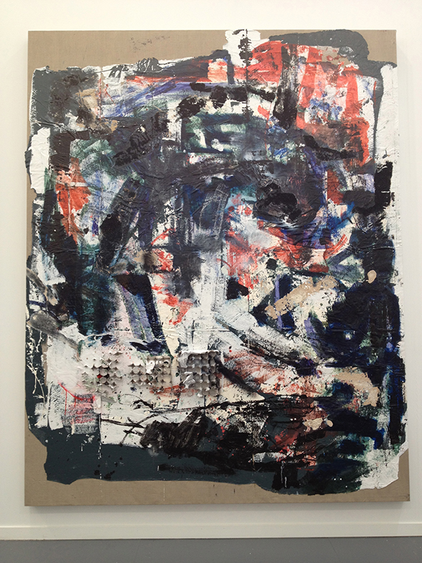
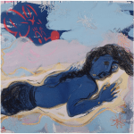
Once dubbed “Neo Brut,” Rosy Keyser’s work combines cast off materials with painterly gesture. The big lumpy piece shown above is unusual for Keyser because the color is much bolder than her generally earthy, industrial palette. Last month Keyser had a solo at Peter Blum and her work was also included in “Painter Painter,” the recent show of painting-objects at the Walker.
Matt Johnson, whose work typically explores the difference between real objects and sculpture, crosses over into painting territory with this wall piece created from a blue tarp. I like the inclusion of a silver grommet on the left edge, a detail revealing that we’re looking at a section of something that was originally much larger. Image above:
Painted Tarp, 2013, blue tarp, fiberglass, epoxy, acrylic paint, 51 x 66 inches.
Covering canvas with what looks like graphite and attaching it loosely to the stretchers so that undulating ripples form,
Edith Dekyndt creates elegant image-objects that mysteriously infuse a Minimalist aesthetic with a sense of dark pathos. Deykundt just had a solo show at
Carl Freedman in London that included several unstretched pieces as well as paintings made by soaking satin and velvet in wine and coffee.
Known for working expansively across media–sculpture, installation, performance, drawing, photography, and video–South African artist Kendall Geers had two crumpled aluminum foil pieces in the
Yvon Lambert booth. Their diminutive size and humble domestic materials mask the confrontation and politics that are hallmarks of Geers’s work. At first they look like formal abstract studies rendered irreverently from a piece of foil, but then the overwrought cruxifix-like impression emerges.
——-
Stay in touch: Receive Two Coats of Paint’s DAILY POSTS via email
and subscribe to the new WEEKLY UPDATE.


Rock solid exhibitio plan…
I think it's popular because it's pretty easy to make. All the values and patterns and texture and illusions are readymade. I realize the "concept" takes time, or it did for the first one, and maybe the artist spends forever planning his or her wrinkles and crumples…to make them seem natural. Maybe I would prefer unnatural, more inventive crumples.
The foil keeps the work fresh.