
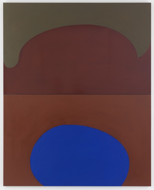
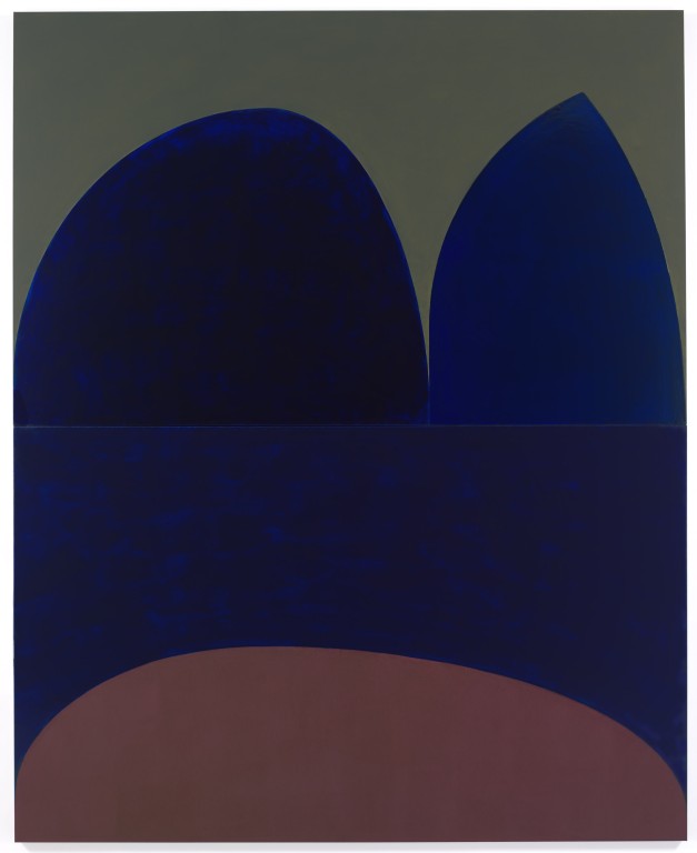
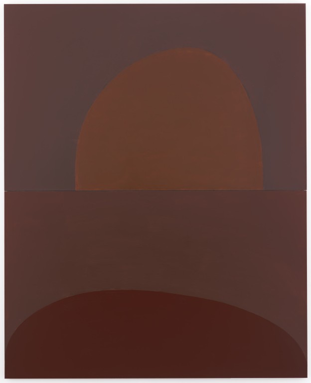
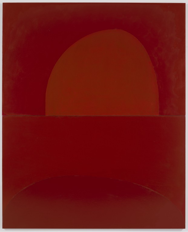
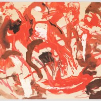
Suzan Frecon,”cathedral series, variation 6,” 2010, oil on linen, diptych, 108 x 87 3/8″ overall.
Suzan Frecon, working notes from 1977.
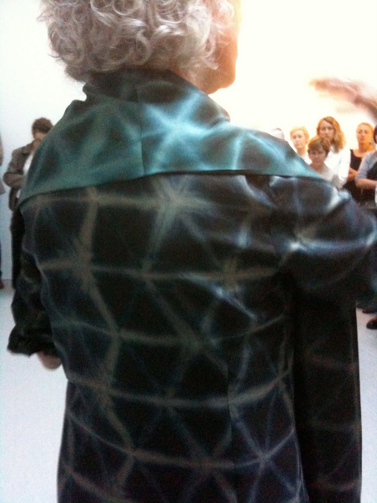
Suzan Frecon’s dress.
I have ideas but…The paint speaks.”
She talks extensively about the process of making paintings. Composition is the bedrock. Integrating the reverse curve is key to the new work–her biggest challenge. She worked from an earlier “Euclid” sketch to develop this body of work. She likes that the rounded shapes can be read as either solid forms or entries. The pigments are ground in linseed oil, and sometimes the paint surprises her. For instance, the more layers of the hematite she applied, the lighter it seemed to get. The amount of linseed oil she mixes into each color determines the sheen, and often oil bleeds into the shapes composed of drier pigments. She works the compositions out on graph paper to get the curves exactly right. Getting the curves right is difficult, and sometimes she works on sketches for years before finding the right composition.
Cezanne quote: Art has a harmony that parallels that of nature.
The Cathedral series. Frecon talks about her paintings in the order she made them and notes that the relationship to actual cathedrals is obscure, but she loves visiting cathedrals and imagining them in their prime–especially the ones that are in ruins. She loves their proportions. Frecon is also attracted to visual phenomena and recalls an old film still from a movie in which light reflects on car windows. She’s interested in common denominators–like the earthy colors she uses. She’s most passionate about RED. The earthy red colors drink up the oil. She favors these reds because she sees them used across cultures–in cave paintings, Crete, religious icons, and more. The color is a unifying element, although its meaning is enigmatic and ungraspable.
Someone asks, Why diptychs? “I was working smaller, and I wanted more height so I added another canvas on top,” she says. She was surprised when the size, which she arrived at intuitively, turned out to be the Golden Proportion. Another person asks about her relation to Minimalism. “I am drawn to Minimalism,” she says. But then she admits she’s actually more interested in older work that perhaps has common roots w Minimalism–like Cimabue, religious icons, cave, and Japanese paintings.
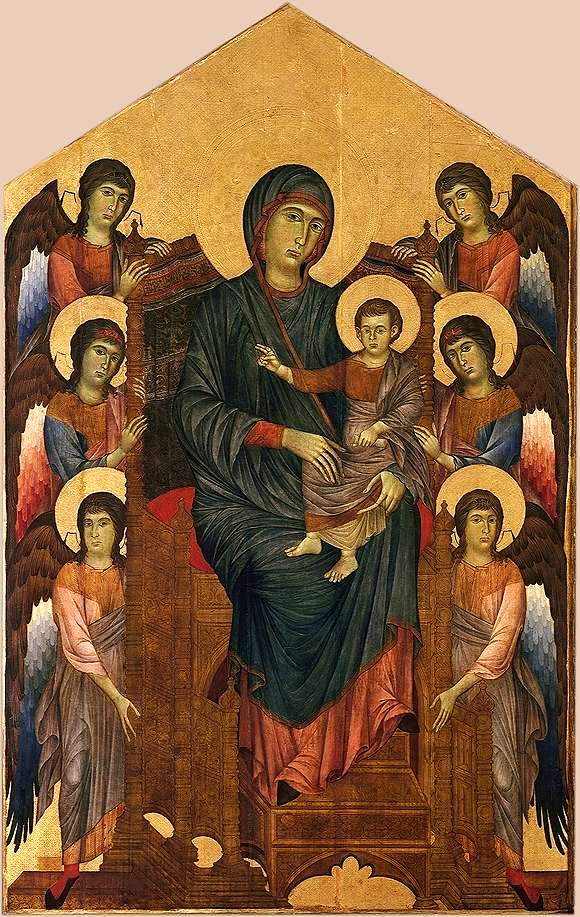
c. 1280 � R.M.N./H. Lewandowski


Thank you for posting this!
Frecon's work looks so convincing, so true in every way, even in jpg. I believe her.