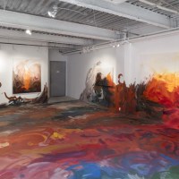
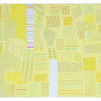
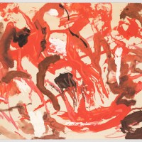
In the Hartford Courant Roger Catlin reports that the newspaper world doesn’t pay too much attention to the fonts of type “that march our ideas along, line by line, day in and day out, in column inches. There’s little time to consider the spurs, tails and eyes of the letters: the neat little shoes of the serif or the sleeker simplicity of the sans-serif. The artist Carol Padberg has studied typography, especially the modernist fonts of Bauhaus, Futura and Helvetica, in her work in encaustic paintings and in polymer resin. Her newest large-scale work at Real Art Ways, opening today, shatters and recombines parts of type in a wall-sized collage in shades of red and burgundy. Her ‘Helvetica Mash Up’ is vivid and striking and suggests perhaps a message in there somewhere, backward or forward, or in parts, or even in the negative spaces.”
“I choose materials with which I can create a tension between the flat graphic voice of typography and the fluidity of paint and handwriting,” Padberg says. “Sometimes comical, sometimes minimal, these images ask questions about design, nonverbal language, and the modernist lineage of abstract painting.”
Check out the installation video here.
“Carol Padberg: Face Value,” Real Art Ways, Hartford, CT. Through Jan. 11. Padberg will give a talk about the work on Thursday, Dec. 4 at 6 pm.